


How to Choose Paint Colours
Posted by CELTIC SUSTAINABLES on 22nd Mar 2018

It’s easy to look at a paint chart and pick out all of the colours you really like, but imagining those colours in the room you’re planning on painting – and knowing what different colours will look like when they’re put together – can be a much harder thing to do.
That’s why we’ve put together this handy guide to choosing paint colours, which you can read through before you order so that you’ll never pick the wrong paint again!
1. Keep it personal
You want the colour of your walls to reflect you and your tastes, using colour combinations that mean something and cause an emotional reaction. Bear in mind that one colour 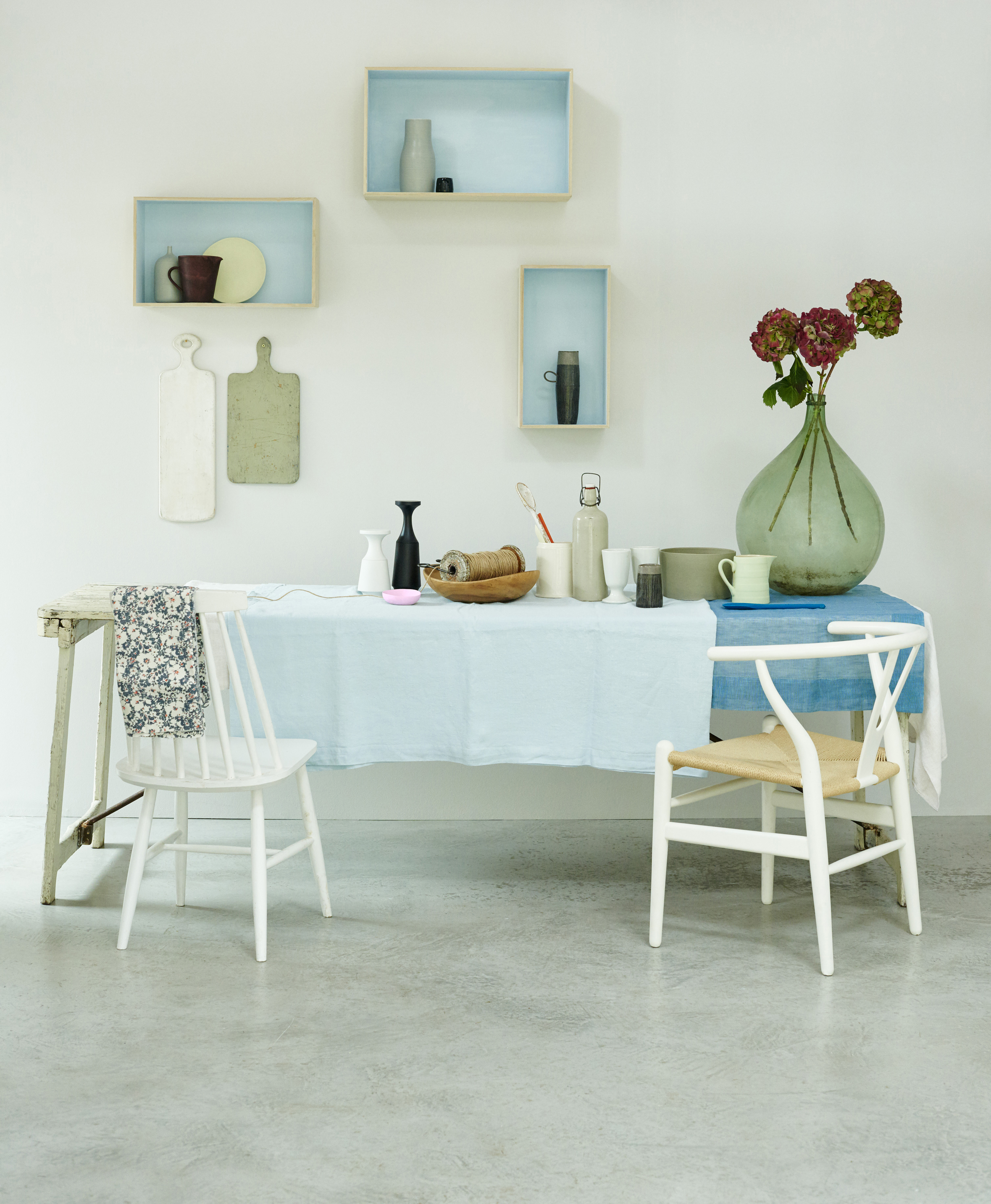 might look very different when combined with another, creating a completely new effect. The best palettes, according to Grand Designs presenter Kevin McCloud, is “a palette that’s not just a set of interesting or strong colours: it’s something that has its own identity above those colours and which can trigger strong associations, sometimes in our subconscious, of a time or place or emotion.”
2. Keep a colour scrapbook
Whenever you think of or spot a colour combination you like, make sure you record it. Your scrapbook can be filled with postcards, magazine spreads, photographs, or fabric swatches. You’ve probably got a camera at the ready at all times in the form of your mobile, so utilise it to take visual notes of the colours you see when you’re out and about.
3. Know your tones
To create a truly relaxing space, choose a harmonious, tonal colour scheme. What does this mean? It’s where you pick paints adjacent to each other on the colour wheel, combining them to create a balanced effect. Tonal schemes are created by picking various shades of the same colour. Pick several shades from the same segment of the colour wheel, or from the same stripe card to come up with a harmonious scheme. Here Earthborn discuss choosing neutral paint colours for a bedroom with warm tones "Warm neutrals work in virtually any space, whether your bedroom is small and cosy with little light, or big and bright with large windows. If your room is north facing (so it has a colder light) then warm neutrals will add depth to the space. Piglet works especially well in these rooms because the undertone is slightly pink. If your room is south facing, warm neutrals will enhance the feeling of light."
4. Creating contrast
If you want to go in the opposite direction and create a vibrant, expressive look, go for a selection of contrasting paint colours. Pick a main colour, and then find its direct opposite on the colour wheel. This can be used as an accent colour or to form a hard-hitting feature wall.
fine-plasterwork
5. Utilise light - MAKING ROOMS FEEL LIGHTER
Take into consideration the aspect of every room. A north-facing room can feel quite cold and gloomy, so to warm it up a little you can use reds, oranges, and yellows. By the same token, south-facing rooms can be made to seem cooler by using fresher shades of blue or green. The experts over at Farrow and ball say "By using darker colours in a hallway, you can instantly make the other rooms off the hallway seem ardently brighter, and bigger. Meander into a lighter room from a dark space, and it’s bound to feel cavernous. Colours like Elephants breath No. 229 and Down Pipe No.26 with Slipper Satin No.2004 would be perfect for hallways. Most of us have a small room that does not exactly benefit from natural light, and we all share an urge to paint it eye-wateringly white to force it to feel brighter. But rather than unwittingly creating a doctor’s waiting room in your downstairs bathroom; instead use warm, darker colours or even bold patterned wallpapers to create a dramatic, yet intimate atmosphere." Colours like Brinjal No.222 and Hague Blue No.30 in modern emulsion is perfect for small bathrooms.
6. Don’t forget the furniture
Unless you’re planning a complete refurbishment, it’s best to bear in mind the furniture you already own. You’ll want your pieces to incorporate easily into the scheme, and you can even use existing furniture as a starting point for the colours you choose. Perhaps a particular fabric has a nice shade of green you want to replicate on the walls, so take a picture or piece of it with you when you go paint shopping. And if your bored of old furniture; Earthborn's Eco Chic range is a wonderful way to transform a tired piece of furniture into your own little masterpiece. Created specifically for furniture painting projects, it has great qualities, is breathable and has a very flat matt finish
"Don't ignore your floor colour: it's the second largest surface to the walls and will have a colour of its own. Even wooden floors have a shade, whether honey hued, cherry or limed, and this will effect how paint will look." House&Garden
7. Think about the flow
The room you’re decorating doesn’t sit alone in the house, so it is a good idea to consider how the colours of any adjoining rooms work with the paint you choose. Adjoining 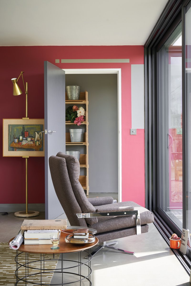 rooms should either harmonise or contrast, as opposed to clash. Don’t forget to think about the mood of your room. Your dining room might be a place of fun and laughter with friends and family, so could take on bright and bold. A child’ bedroom might need a calmer colour scheme to encourage a restful night’s sleep. - Ideal Home
"Let your art lead you: gather your artwork together and look for a colour that stands out; this can be a fantastic way of choosing an accent paint." Home&Garden
8. Fix on a theme
When choosing paint, you want your choice of colours to reflect you and the things you own. You might want to create an earthy, organic feel, a vintage look, or a more modern atmosphere. Which you choose will depend upon you and your belongings. Earthy schemes are created using colours like terracotta or ochre. Vintage looks utilise muted shades, whilst a modern feel is achieved using more vivid colours like violet, lime green, magenta, and cyan (but it’s probably best not to use all of these together). A great idea is to look outside for colour inspiration. Read these tips on decorating for the four seasons.
9. Pick up paint samples or tester pots
This is very important, especially if you’re buying paint online. The colour of paint will look different on almost every screen, so you’ll need to get hold of an actual sample to determine what it looks like on the walls of your home. Paint a big patch of the wall, and watch how the colour changes as the light alters throughout the day to be sure you like it at all times.
Ideal Home say "Check colours in the room you’re decorating, not in store. A colour card only shows tiny amounts so can be deceptive; if in doubt, choose a couple of shades lighter. Use a sheet of white paper to isolate your colour choice without it being affected by nearby shades. Buy three tester pots in related colours and paint at least 60 sq cm onto lining paper. When dry (colours often dry a little darker) tack them up, trying them on different walls to check the effect."
10. Buy from the same batch
It can never be guaranteed that one kind of paint will all be exactly the same colour if it comes from different batches, so make sure you buy all your paint from one batch to avoid any variations.
One last thing: choose Low to No-VOC Paint
Many commercially available paints are packed with harmful VOCs (Volatile Organic Compounds) which remain in the air for years after a room is painted (they are the chemicals that give paint that characteristically toxic smell). They’re especially harmful to sufferers of respiratory problems such as asthma, but cause harm to anyone exposed to them. Thankfully, there are low- or no-VOC paints such as eico, Graphenstone and Earthborn to choose from so you needn’t breathe in any of the nasty stuff at all.
Insider Tip: If you've taken a colour card home with you, peal the little square out and place it on a white background like white paper. This will give you an idea of how the colour looks like without it being effected by the colours next to it.