


Discover the Beauty of Gradient Layering
Posted by Sarah, Celtic Sustainables on 3rd Sep 2026
Go beyond colour drenching and try gradient layering. Using tonal shifts within one colour family brings depth, character and personality to your space.
Looking for a fresh approach to decorating? Why not move beyond colour drenching and explore the subtle beauty of gradient layering?
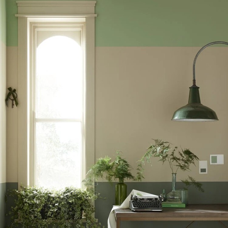
Gradient Layering By Earthborn in Green Shades.
By using different tonal variations within the same colour family, you can create a space with added depth, warmth, and personality while maintaining a calm, cohesive feel. From soft transitions on walls to complementary shades on woodwork and architectural features, gradient layering brings a sophisticated, designer-inspired finish to any room.
Whether you're renovating a period property or refreshing a modern interior, this technique works beautifully with breathable, sustainable paints, allowing you to create a timeless look that's full of character without overwhelming the space.
At Celtic Sustainables, we love seeing how carefully chosen colours can transform a room. If you're considering gradient layering for your next project, we're always happy to help you choose the perfect shades and finishes to bring your vision to life.
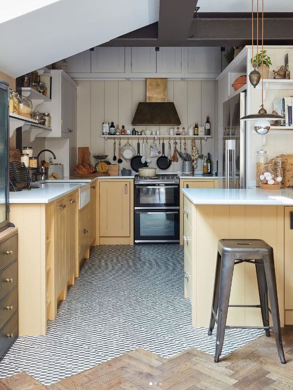
Kitchen scene featuring Earthborn Paint, Humpty Dumpty Eggshell for wood, Tom's Bakery on wall panelling, and Earthborn Clay White on the ceiling.
Elevate Your Interiors with Gradient Layering Using Earthborn Claypaint
Gradient layering with Earthborn Paints is very easy. It’s a beautiful decorating technique that uses tonal variations within the same colour family to create depth, movement and visual interest.
Earthborn Claypaint is particularly well suited to this look thanks to its rich pigmentation, ultra-matt finish, and beautiful colour palette. Whether you're creating a soft, calming transition between gentle neutrals or a bold ombré effect with deeper shades, gradient layering can bring a sophisticated, contemporary feel to any room.
Because Earthborn Claypaint is a natural, breathable clay-based paint, it behaves a little differently to conventional emulsions. Its creamy consistency and quick drying time mean a little extra preparation is needed to achieve a seamless blend. We recommend choosing two or three complementary shades, using quality brushes, and keeping a water spray bottle close at hand to help maintain a workable edge while blending.
Pick a colour group that you want to go for and pick three or more colours from that spectrum; examples include:
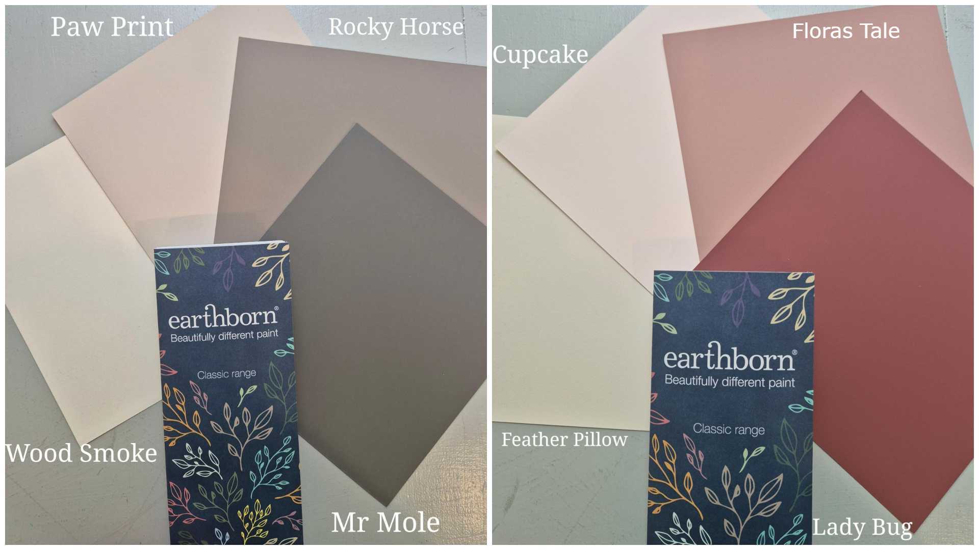
Earthborn Pinks: Lady Bug, Flora’s Tale, Cupcake and Feather Pillow.
Earthborn Neutral Browns: Mr Mole, Rocky Horse, Paw Print and Wood Smoke.
Before you begin, ensure the surface is clean, stable, and free from dust. On bare or highly absorbent surfaces, a diluted priming coat of Claypaint will help create an even base for your chosen colours.
It's a simple yet effective way to add personality and character to your home while making the most of Earthborn's stunning range of colours.
How to Create a Gradient Layered Look with Graphenstone
Looking for a softer alternative to colour drenching? Gradient layering uses several shades from the same colour family to create a beautiful flow of colour throughout a room. The result is subtle, sophisticated, and full of depth - perfect for adding character without overwhelming a space.
Graphenstone first recommends choosing the colour family:
Start with three or four related shades that naturally complement one another. Earthy neutrals, warm greys, and soft greens work particularly well for this technique.
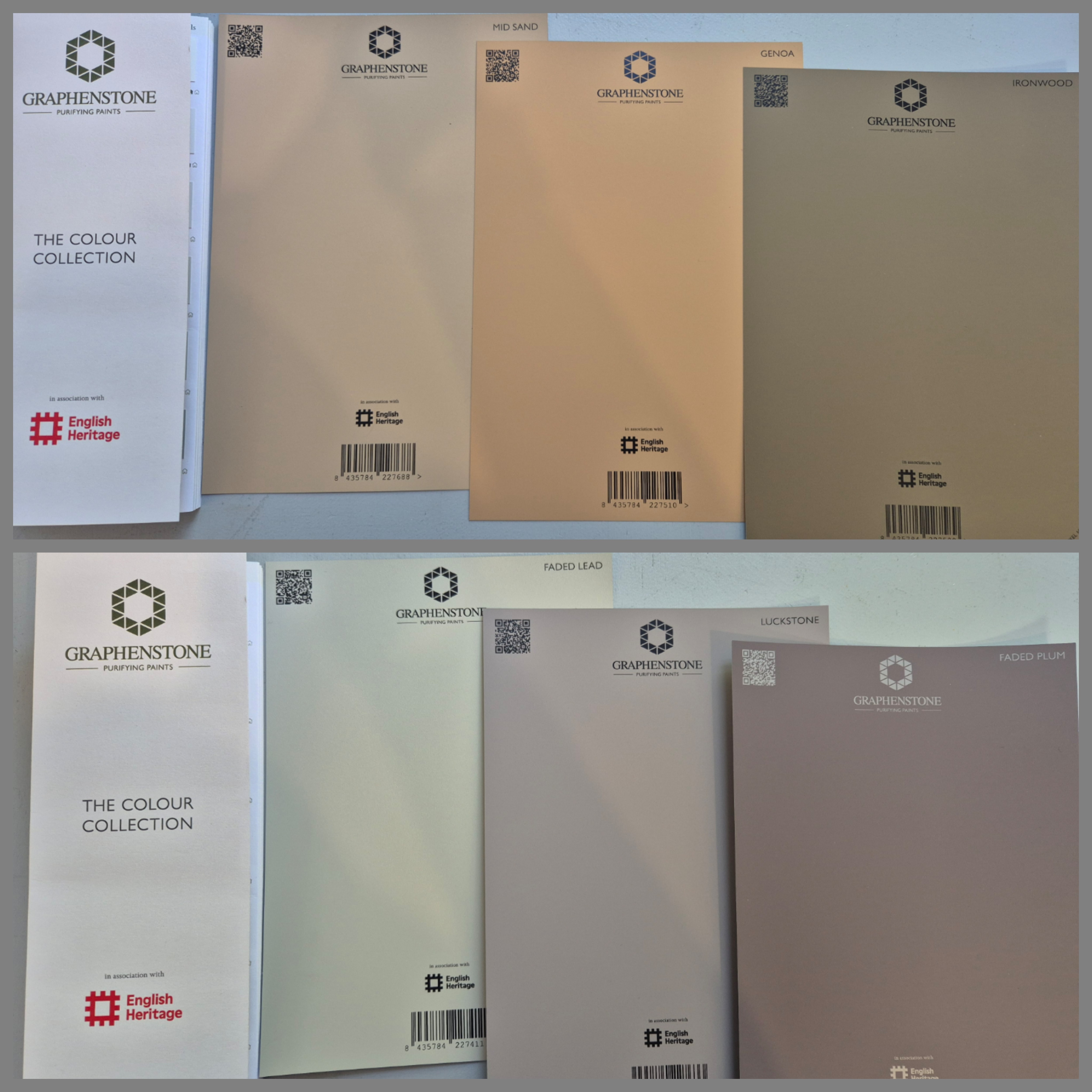
Some beautiful combinations include:
- Earthy Neutrals: Mid Sand, Genoa, Ironwood
- Greys & Taupes: Faded Lead, Luckstone, Faded Plum
Secondly, follow the Graphenstone 3-Tone Rule:
For a seamless gradient effect, use your colours in stages:
- Darker shades on lower walls
- Mid-tones across the main wall areas
- Lighter shades on ceilings, alcoves, or upper sections
This gentle transition draws the eye upwards and can help a room feel taller, lighter, and more spacious.
A Few Colour Planning Tips from eicó
The team at eicó paints shared some useful advice with us for anyone looking to try gradient layering at home. This decorating technique uses tonal variations from the same colour family across walls, ceilings, woodwork, or architectural features to create a gentle flow of colour and a beautifully balanced interior.
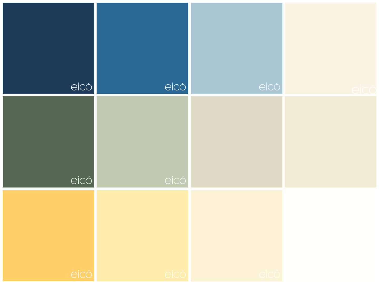
Some Favourite eicó Colour Combinations:
The Blue Ombré – Serene & Fresh
- Johan, Baltic Sea, Surf and Painter's White
The Green Haven – Organic & Cosy
- Groden, Sea Grass, Poppy Stem and Gardenia white
The Warm Neutral Blend – Timeless & Relaxed
- Sunset, Vanilla, Linen, Oyster
Before You Pick Up a Paintbrush
- Test colours in your own space. Natural daylight, artificial lighting, and room orientation can all influence how a colour appears.
- Follow the 60-30-10 rule. Use 60% as your dominant shade, 30% as a secondary colour, and 10% as an accent to create a balanced scheme.
- Try samples first. A sample pot is always cheaper than repainting a whole room! We offer colour cards, swatches, and sample pots across many of our paint ranges to help you find the perfect combination.
Gradient layering is a wonderful way to add depth and personality to a room without overwhelming the space. If you'd like help selecting colours for your project, feel free to get in touch - we're always happy to talk paint!